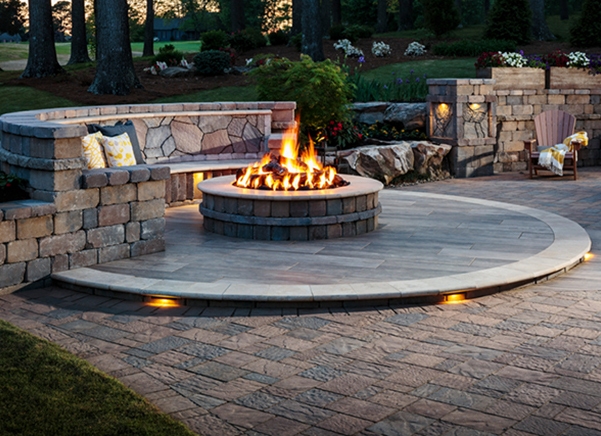
When selecting hardscapes, it’s important to spend some time considering the options. Belgard hardscapes are warrantied to last the life of the home, which means your new outdoor living space will become an extension of the home itself.
Hardscape Color Options
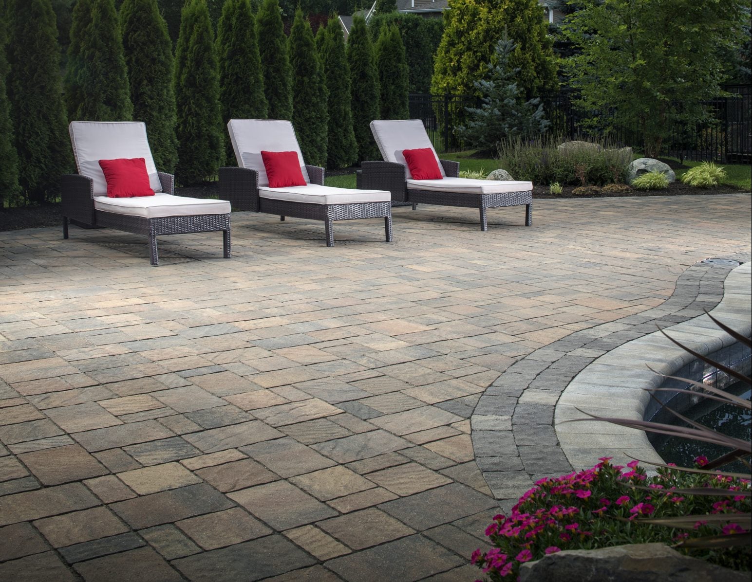
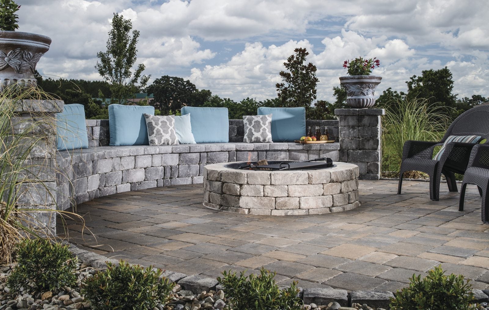
Belgard pavers and retaining walls are manufactured at multiple facilities across the nation using local natural materials and aggregates. Because of this, the exact colors available will vary by region, so it’s best to ask your contractor or dealer to show you samples. That way, you can get a better idea of the exact color palette and see how the colors look when paired with the exterior of your home and any permanent structures or existing outdoor living features, such as a pool.
Cool Versus Warm Colors
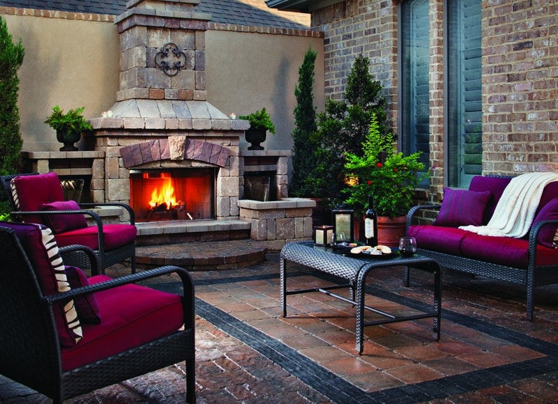
In general, cool colors are considered to be calming and include blues, greens, and deep purples. Whereas, warm colors are associated with excitement and energy and include reds, oranges, yellows and browns. Neutral colors (like beige and gray), can lean to either warm or cool, depending upon the color blend. In terms of hardscape selection, the choice to go with warm or cool color blends is typically a personal preference; however, you should choose a color scheme that is complementary to that of existing structures.
Fun with Paver Colors and Patterns
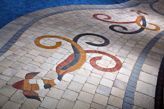
You can also take advantage of color options to create interesting and unique paver designs, like laying out pavers to create the look of a faux rug or integrating bold color choices to create intricate designs. Belgard also has a variety of Porcelain Paver options that emulate the look of wood and other natural materials.
Tone Considerations
Tone refers to the darkness or lightness of a color. Again, choosing lighter or darker tones are mostly a matter of personal preference; however, there are some additional considerations. Darker tones can make a space seem smaller or more cozy, and lighter tones can make a space seem more open and bright. Another consideration when choosing hardscapes is that lighter tones will reflect more of the light and absorb less heat, whereas darker tones (especially really deep tones) will absorb more light and heat.
Continuing the Design Beyond the Hardscapes
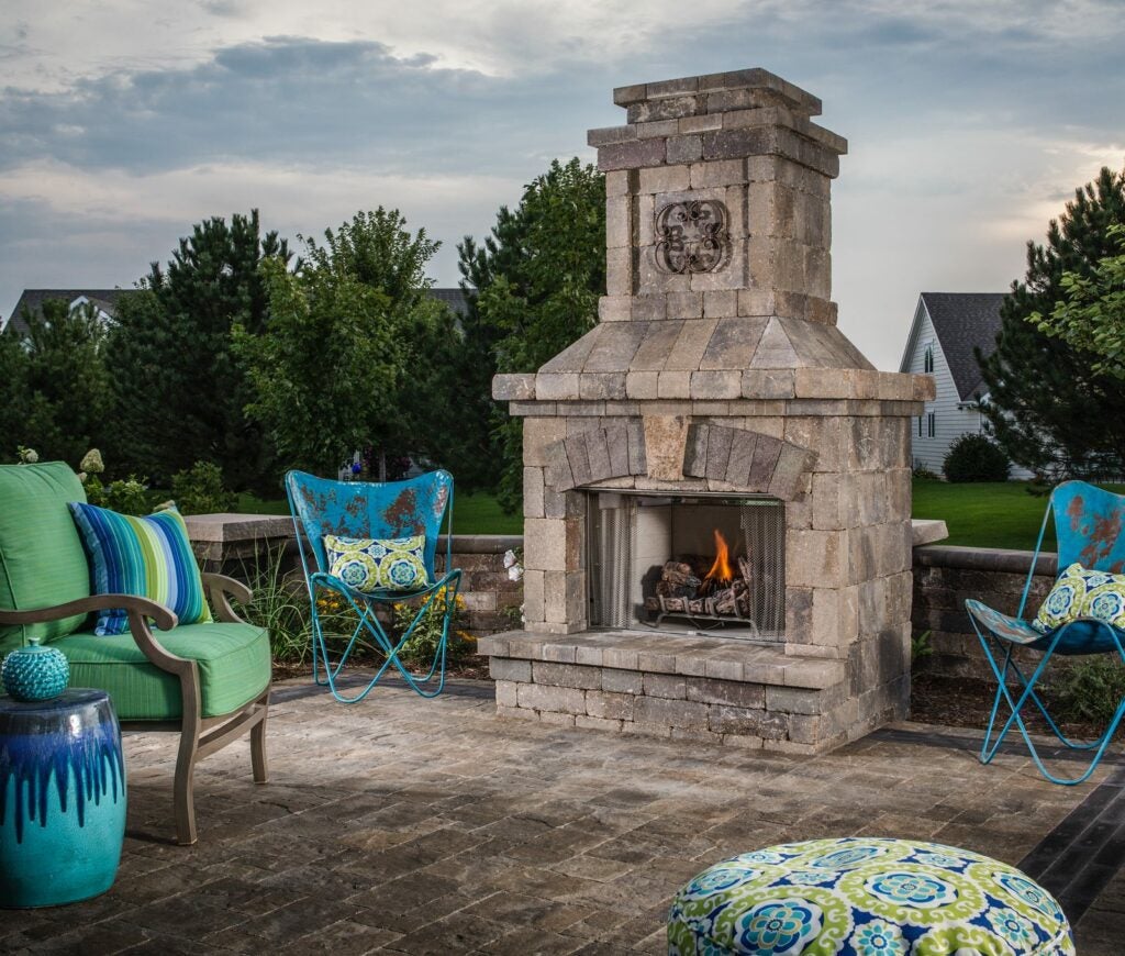
After the hardscapes have been installed, you’ll need to continue making color choices in terms of furniture, area rugs, cushions, throws, light fixtures, umbrellas, accessories and landscaping. Keep in mind that bigger spaces allow for bolder design choices, and bold colors and patterns are becoming increasingly popular. According to the leading interior and exterior design experts at Pantone, popular color choices this season will be oranges, pinks, golds and rich floral hues. Although it’s often wise to use bright colors sparingly indoors, outdoor settings can handle more color without feeling cramped. Even if the majority of your outdoor design is muted or monochromatic, adding a few accents of turquoise, mango, lime or some other bright, cheerful color will make a statement and brighten your outdoor space. Pantone is also predicting a resurgence of black and white designs, as well as an increase in unexpected color combination and pixilated, digitized patterns for fabrics and rugs.
Design Scheme Examples
